I recently received news that Font Awesome version 6 is on it’s way. I pay for the Pro version of the library despite the fact that I am not a visual designer. In fact, most of my design work has been described as “not offensive” and sometimes I hit “looks alright”. Font Awesome makes it possible for me to stretch some custom elements up to the “better than alright” level.
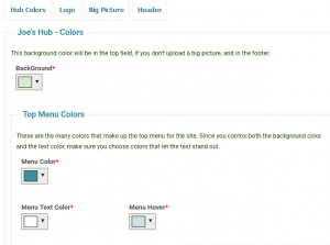
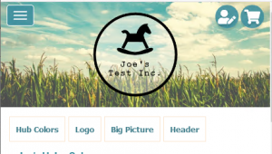
Years ago, I designed a farmer’s market application for a company called Lulu’s Local Food. Part of setting up a farm is the ability to pick the colors and upload the header graphics. Since I have no control of the color scheme it was always difficult to make custom buttons and icons.

In the first version of the platform, I used graphics with partial transparencies and would flip the graphic from light to dark based on the numerical value of the background color. It didn’t “look terrible”, but it was always a challenge to make the sites look good.
Then I discovered Font Awesome and it literally changed my life… or at least the site. Now it was possible to create icons and menu items that could track all the color changes made by the users. These icons have the added benefit of being awesome!
